1. Matplotlib 그래프 간단 정리
Matplotlib는 파이썬에서 데이터를 차트나 플롯(Plot)으로 그려주는 라이브러리 패키지로서 가장 많이 사용되는 데이터 시각화(Data Visualization) 패키지로 알려져 있다.
(Matplotlib 안의 설정을 하나씩 바꿔가면서 기본적인 그림만 보여주며 설명하려 한다.)

Line plot
fig, ax = plt.subplots() # 괄호 안이 공란이면 1개의 fig 만 만들어 준다.
x = np. arrange(15) # 0~14
y = x**2 # x의 2 승
ax.plot(
x, y,
intstyle=“:”, # 선이 점선으로 표시
marker=“*” # 값들을 *표시
color = “#524 FA1” # 색깔 표시
)

Line style
x= np.arrange(10)
fig, ax = plt.subplots()
ax.plot(x, x, linestyle=“-“)
ax.plot(x, x+2, linestyle=“—“)
ax.plot(x, x+4, linestyle=“-. “)
ax.plot(x, x+6, linestyle=“:“)

Color
x = np.arrange(10)
fig, ax = plt.subplots()
ax.plot(x, x, color=“r “)
ax.plot(x, x+2, linestyle=“green “)
ax.plot(x, x+4, linestyle=“0.8 “) #0~1 gray
ax.plot(x, x+6, linestyle=“#524 FA1 “)

Marker
x= np.arrange(10)
fig, ax = plt.subplots()
ax.plot(x, x, marker=“. “)
ax.plot(x, x+2, marker=“o “)
ax.plot(x, x+4, marker=“v “)
ax.plot(x, x+6, marker=“s “)
ax.plot(x, x+8, marker=“*“)
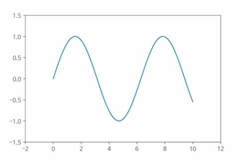
축 경계 조정 하기
x= np.linspace(0, 10, 1000) # 0 : Start, 10 : end, 1000 : step
fig, ax = plt.subplots()
ax.plot(x, np.sin(x)) # sin(x) 그래프
ax.set_xlim(-2,12) # x축 limit 한계를 정하는 것
ax.set_ylim(-1.5,1.5) # y축 limit 한계를 정하는것
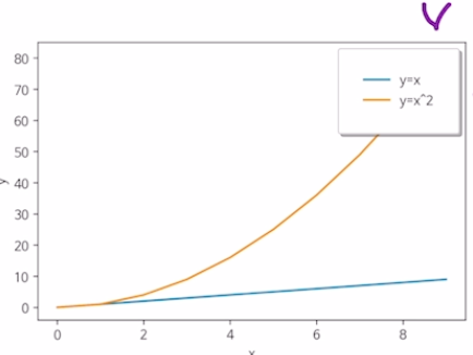
범례 추가하기
x= np.arrange(10)
fig, ax = plt.subplots()
ax.plot(x, x, label=‘y=x’)
ax.plot(x, x**2, label=‘y=x^2’)
ax.set_xlabel(“x”)
ax.set_ylabel(“y”)
ax.legend(loc=‘upper right’, # 위쪽 오른쪽 위치
shadow = True, # 그림자 설정
fancybox = True, # 범례 박스 모서리를 둥그렇게 만들어라
borderpad=2) # 보더 패드 크기 설정
2. Bar & Histogram
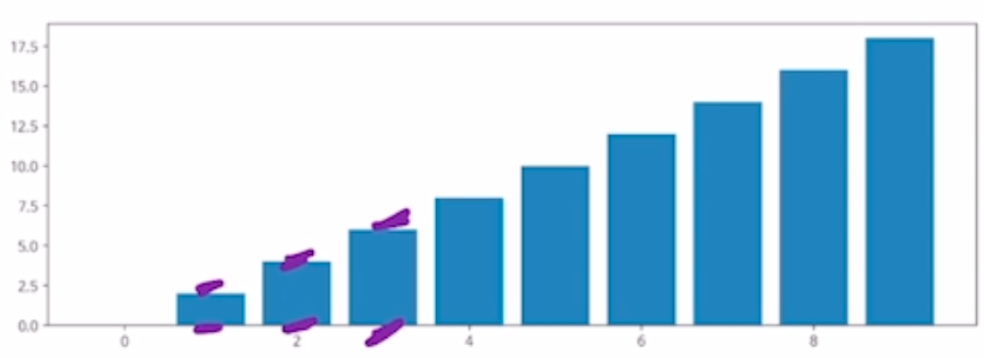
Bar plot(1)
x = np.arrange(10)
fig, ax = plt.subplots(figsize=(12,4)) # 가로, 세로
ax.bar(x, x*2) # x, y 값

Bar plot(2)
x = np.random.rand(3) # 0~1 사이 3개 값 뽑기
y = np.random.rand(3)
z = np.random.rand(3)
data = [x, y, z]
fig, ax = plt.subplots()
x_ax = np.arrange(3)
for i in x_ax:
ax.bar(x_ax, data [i], # x축, y축
bottom=np.sum(data [: i], axis=0))
<# 쌓아 올리는 시작점 axis=0 을해서 세로로 쌓아 올라감>
ax.set_xticks(x_ax)
ax.set_xticklabels([“A”,”B”,”C”])

Histogram(도수 분포표)
fig, ax = plt.subplots()
data = np.random.rand(1000)
ax.hist(data, bins=50) # 1000개의 데이터를 뽑았는데 50개의 막대로 나타낸다는 것

Matplotlib with pandas
df = pd.read_csv(“./president_heights.csv”) # 파일 읽기
fig, ax = plt.subplots()
ax.plot(df[“order”], df[“height(cm)”], label=“height”)
ax.set_xlabel(“order”)
ax.set_ylabel(“height(cm)”)
'Python > Alice Python Basic' 카테고리의 다른 글
| Python 기초 프로그래밍의 간단 정리5 (0) | 2021.07.08 |
|---|---|
| Python 기초 프로그래밍의 간단 정리4 (0) | 2021.07.08 |
| Python 기초 프로그래밍의 간단 정리3 (0) | 2021.07.07 |
| Python 기초 프로그래밍의 간단 정리2 (0) | 2021.07.07 |
| Python 기초 프로그래밍의 간단 정리1 (0) | 2021.07.07 |


